

Music Analytics for Artists: What to Track
Music analytics gets useful when you stop asking “Did the number go up?” and start asking “What caused the lift, did it hold, and should I buy more of it?”
This guide assumes you already have music out and access to your artist dashboards. You have seen release spikes, playlist traffic, and the slow drop that comes later. You may have run ads or paid for promotion. Now you need to know whether the growth was incremental, where it came from, and whether it is worth repeating.
If you need a guide to the dashboard itself, use our Spotify for Artists guide. This page starts with decisions.
Who this is for
This is for an independent artist with a growing catalog and enough data to make choices.
Maybe one song gets more saves while another gets more streams. Maybe your ads look good, but Spotify barely moves. Maybe a playlist added thousands of listeners and left almost nothing behind. These are measurement problems, not beginner problems.
The four questions behind the dashboard
Every useful review comes back to four questions:
- Lift: What happened beyond the growth you would expect anyway?
- Quality: What did the new listeners do after the first play?
- Carryover: Did any of that attention reach your catalog or last after the push?
- Cost: Did the next block of growth get cheaper, stay stable, or get worse?
Answer those four and you can make a sound call on budget, audience, creative, and timing.
What You’ll Learn
- How to measure campaign lift against a fair baseline
- How to compare listener quality by source, market, and creative
- How to spot catalog spillover and real audience carryover
- How to use cohorts without turning your report into a data project
- How to handle attribution when platforms do not share user level data
- How to measure the cost of the next block of growth
- When to scale, hold, fix, or stop a campaign
Start With Incremental Lift, Not the Total
Your total tells you what happened. Incremental lift is the part that likely would not have happened on its own.
Music moves without a campaign. Release day creates a natural spike. Editorial and user playlists can appear. Old content can pick up. A normal week can be stronger than the week before. If you credit all growth to one campaign, you will overpay for results you may have received anyway.
Build the expected baseline
Start by asking what the song or catalog would likely have done without the new push. The right baseline depends on the job.
| What you are measuring | Useful baseline | Why it works |
|---|---|---|
| An older song | Recent quiet weeks with the same days and markets | The track already has a normal level |
| A new release | Your last few releases at the same release age | New songs tend to fall on a curve |
| A market test | Similar cities or countries that did not get the campaign | They show what moved without the spend |
| A catalog campaign | The catalog floor before the push | You can see whether more than one track moved |
For a stable track, you can use the middle daily result from a few quiet weeks. The middle is often safer than the average because one random spike will pull an average up.
For a new release, compare day seven with day seven, never release week with a quiet month. Use the same time zone, markets, and song set, because small mismatches can create fake lift.
Net listener lift equals observed listeners minus expected listeners.Say an older song normally gets 120 listeners a day. During a campaign, it gets 220. The raw gain of 100 listeners a day is your first lift estimate, but it does not prove the campaign caused all 100. A playlist add, creator post, or release event may have helped.
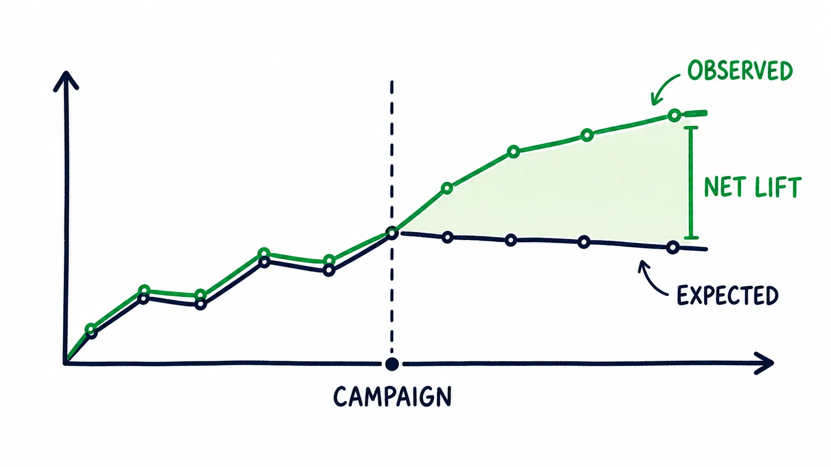
Net lift is the gap between what happened and what likely would have happened anyway.
Use a control when the budget matters
A control is a similar group that does not get the test. Where the platform gives you enough market data, you can hold out a few matched cities, delay one market by a week, or stagger two ad groups instead of launching everything at once.
Suppose target cities rise 40 percent while similar control cities rise 15 percent. The campaign may have added about 25 points of extra growth, a much stronger read than “listeners went up 40 percent.” Markets never behave in exactly the same way, so it still isn’t perfect, but it beats a simple before and after chart.
Report a range when sources overlap
Sometimes a campaign, playlist add, and creator post all hit in the same week. You cannot split that lift with clean math after the fact, so give the result a range.
For example, observed listeners rose by 700. Your normal release curve explains about 200. A new playlist may explain another 100 to 250. That leaves the paid campaign adding 250 to 400 listeners. That range is honest. “The campaign delivered 700 listeners” is not.
For cleaner answers next time, separate the start dates. Even a short gap makes the source pattern easier to read.
Measure Listener Quality by Source
Once you find lift, ask what kind of lift it was.
Spotify splits chosen activity from programmed activity in its official source of streams guide.
Search, artist profile plays, and a listener’s own library show clear choice. Radio, autoplay, and programmed playlists can bring discovery with less intent. Neither source is always good or bad. Judge it by what happens next.
| Source pattern | What it may mean | What to check |
|---|---|---|
| Chosen source with strong repeat play | People meant to find the music and stayed | Saves, follows, catalog plays, active audience |
| Programmed source with strong repeat play | Passive discovery may be turning into interest | Profile traffic, saves, later active listening |
| Chosen source with weak depth | The message earned a click, but the song did not hold | Message match, landing path, first song choice |
| Programmed source with weak depth | The exposure may be short lived | Source mix after the placement ends |
Use a quality stack
One rate cannot tell you if a listener is valuable. Use a small stack of signals.
| Signal | Simple math | What it adds | Main limit |
|---|---|---|---|
| Streams per listener | Streams divided by listeners | Shows average play depth | A few heavy listeners can lift it |
| Listener save rate | Saves divided by listeners | Shows chosen intent | Source and sample size change it |
| Follower lift proxy | Net new followers divided by net listener lift | Shows whether reach and follows moved together | It cannot prove the same people followed |
| Catalog spillover | Lift on other tracks beside the focus track | Shows artist interest beyond one song | The dashboard may not link the same listeners |
| Post campaign floor | Daily listeners after spend ends versus before it began | Shows whether any lift stayed | New events can change the floor |
The follower lift number is a proxy, a useful stand in when direct tracking is missing. Do not call it follower conversion. Spotify does not tell you that the exact same new listeners became followers.
Save rate has the same problem. Artists often compare rates that use different math, so ask what sits under the fraction. Our Spotify saves guide explains the denominator problem. The Spotify monthly listeners guide explains the rolling audience window.
Keep source windows clean
If you run ads, playlist promotion, and creator posts at the same time, you may get reach, but you will learn less about each source. Separate campaigns when the learning matters.
Split by date, market, creative, or focus song, whichever fits the decision you need to make. If Spotify does not show saves by traffic source, use the cleanest market and time window you can, then label the result as an estimate.
Key takeaway
Check Whether One Song Lifted the Artist
A campaign can win for a track and lose for the artist. This happens when the focus song gains streams, but the rest of the profile stays flat.
Track level reach still has value. It can seed discovery, build proof, and raise royalties. It is a different result from artist growth, so look for spillover during and after the campaign.
- Did older tracks gain listeners or streams?
- Did artist profile and search activity rise?
- Did followers move above their normal pace?
- Did active audience grow after programmed traffic arrived?
- Did the next release start from a stronger floor?
Spotify’s audience segments guide helps separate active, previously active, and programmed listeners.
Our Super Listeners guide goes deeper into the group that stays close. The Spotify release engagement guide helps you check whether an existing audience showed up for the next song.
Read focus track lift and catalog lift side by side
| What moved | Likely read | Next question |
|---|---|---|
| Focus track only | The campaign sold one song | Was that the goal, and can the song keep working? |
| Focus track and older catalog | Listeners may be exploring the artist | Which older tracks caught the spillover? |
| Catalog and followers rise | The artist relationship may be growing | Does active audience hold after the push? |
| Streams rise but active audience falls | Programmed reach may be replacing chosen listening | What happens when the placement ends? |
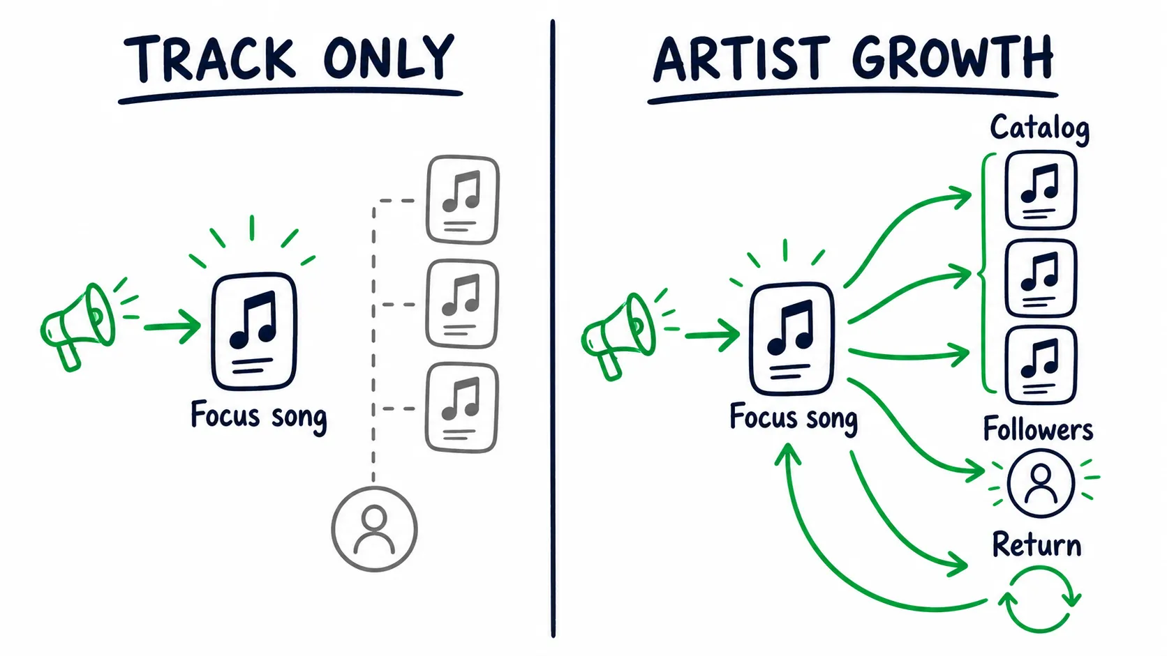
Track growth stops at one song. Artist growth creates catalog, follower, and return signals.
Do not expect spillover from every source. A sleep playlist may fit one ambient track and give listeners no reason to open the profile. That can still be a good track placement, as long as nobody sells it as deep fan growth. Set the scorecard by the goal.
Use Cohorts Before Blended Averages
A cohort is a group of listeners tied to the same source, market, time, or creative.
You may have a paid social cohort, a playlist cohort, and an existing active audience. Mixing them can hide the reason a rate changed.
Campaign A spends $200. It gets 1,000 cheap clicks and about 120 net new listeners. The matched window adds eight saves and two followers.
Campaign B spends $220. It gets only 400 clicks, but about 150 net new listeners. Its matched window adds 30 saves and 12 followers.
Campaign A wins on click cost. Campaign B wins on cost per net listener and shows much stronger behavior after the click.
| Campaign | Spend | Clicks | Net listener lift | Cost per net listener | Matched saves | Follower lift |
|---|---|---|---|---|---|---|
| A | $200 | 1,000 | 120 | $1.67 | 8 | 2 |
| B | $220 | 400 | 150 | $1.47 | 30 | 12 |
Those saves and follows still cannot be tied to exact users. They are matched movement in the same window. Report them that way and the test stays useful and honest.
Pick cohorts that can change a decision
Do not split the data twenty ways. Use three to five groups that answer a real question.
- Creative A versus Creative B
- Target market versus control market
- Chosen traffic versus programmed traffic
- New listeners versus existing active listeners
- Campaign week versus the post campaign period
If the split will not change your budget, message, or market, leave it out.
Blended rates can fool you when the traffic mix changes. Your total save rate may fall because a broad playlist became a bigger share, while the paid ad cohort improved. Check the mix before you blame the song.
Attribute Campaigns Without False Precision
Attribution means deciding what likely caused a result. Music platforms rarely give independent artists a clean path from ad impression to named listener. You can still build a strong case if you separate what you know from what you infer.
| Level | What belongs here | How to report it |
|---|---|---|
| Known | Spend, impressions, clicks, link visits, platform totals | Use the direct number |
| Inferred | Listener lift in matched dates and markets | Use a range or proxy |
| Unknown | The exact people who clicked, streamed, saved, or followed | Say the link is not available |
Map the handoffs you can see
A paid music campaign may pass through these steps:
- Impression
- Ad click
- Landing page visit
- Music platform click
- Net listener lift
- Save, repeat play, or follower lift
- Post campaign carryover
Measure each handoff only where the tools support it.
A smart link can show platform clicks, but it cannot prove a Spotify stream. Spotify can show listener lift, but it cannot tell you which ad account sent each listener. To connect the two, use this directional ratio:
Net listener lift divided by outbound platform clicks.Call it an observed lift ratio, since it does not measure click to stream conversion. Match the dates and markets. Remove known playlist spikes when you can. Report a range if other sources are active.
Design the next campaign for cleaner learning
Plan these before launch:
- Stagger major traffic sources
- Hold out one matched market
- Change one major variable at a time
- Keep campaign and platform time zones aligned
- Save raw counts, not only rates
- Write down any playlist, creator, press, or release event
The music marketing strategy guide can help you set the audience and channel before the test begins.
Scale on Marginal Cost, Not Average Cost
Average cost tells you what the whole campaign cost. Marginal cost tells you what the next block of growth cost, and it is the number that catches audience fatigue.
Suppose the first $100 creates 90 net new listeners, about $1.11 per listener. You add another $100, and this block creates only 45 more listeners. The marginal cost is now about $2.22.
The full campaign average is about $1.48 for 135 listeners, which looks fine. The second block tells you the audience may be running out.
Marginal cost per net listener equals added spend divided by added net listener lift.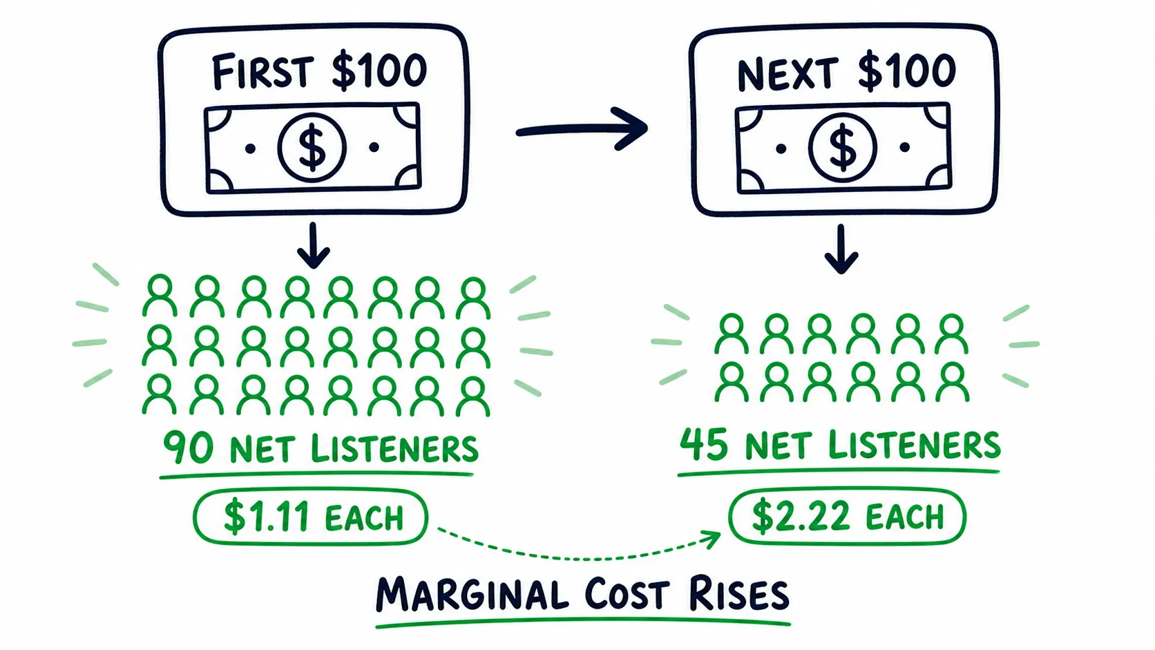
The second budget step brings half the listener lift, so marginal cost doubles.
Track it each time you raise the budget.
Use three gates before you scale
- Lift gate: The campaign beats the expected baseline.
- Quality gate: Saves, depth, source mix, and follower lift stay near your normal range.
- Cost gate: The next block stays under the ceiling you set.
Set your ceiling from the value of the audience. An artist selling tickets and merch can support a different cost than an artist measuring streaming royalties alone. Our music promotion cost guide covers that budget side.
| Decision | What the data should show |
|---|---|
| Scale | Lift repeats, quality holds, and marginal cost stays inside the ceiling |
| Hold | The signal is good, but the sample or reporting window is still thin |
| Fix | Reach arrives, but one handoff or quality signal breaks |
| Stop | There is no clear lift, risk appears, or the next block costs too much |
Do not jump from a small test to the full budget. Raise spend one step, wait for the platform data, and check the three gates again.
Build an Operator Scorecard
Skip the giant dashboard. Keep a clean row for each source or cohort with these fields:
| Field | Why it belongs |
|---|---|
| Release age and date window | Stops unfair time comparisons |
| Source, market, and creative | Defines the cohort |
| Spend and outbound clicks | Shows campaign input |
| Expected and observed listeners | Creates the net lift estimate |
| Streams per listener and save rate | Shows depth and intent |
| Follower and catalog lift | Shows artist level movement |
| Post campaign floor | Shows carryover after the push |
| Marginal cost and decision | Connects the report to the next budget step |
Put the formulas and meanings at the top of the sheet. If save rate means saves divided by listeners, write that once and keep it for the whole release.
Keep raw counts beside rates. A 20 percent rate from five people should not look equal to a 20 percent rate from 500.
Use fixed review points
For a new release, save the scorecard at the same release ages.
Day two can show the first source mix. Day seven gives early quality. Day fourteen shows whether the mix changed. Day twenty eight gives a better carryover view. Treat these as review points; nothing magic happens on those days.
For an always on campaign, use the same weekday and time each week, and compare one cohort at a time.
The Meta ads for Spotify calculator can help model spend and listener lift. The free Spotify growth audit can show gaps in your profile and audience data before you add more reach.
Read Each Platform for What It Knows Best
Do not force one score across every platform. Each one sees a different part of the fan path.
| Platform | Strong signals | Best question |
|---|---|---|
| Spotify | Source mix, streams per listener, saves, active audience, release engagement | Did discovery turn into chosen listening? |
| Apple Music | Plays, listeners, purchases, radio spins, Shazams, cities | Where is real world demand appearing? |
| YouTube | Traffic source, watch time, returning viewers, song rollup | Did the hook earn time and a return visit? |
| TikTok | Video hold, shares, profile activity, sound use | Which idea creates interest before the platform gap? |
Apple Music for Artists includes radio and Shazam activity. Its Shazam guide is useful when one city begins to move.
YouTube Analytics for Artists can combine official music activity across channels. Watch time and returning viewers tell you far more than a public view count.
TikTok creator tools help you read the creative. Outbound listening is still a separate handoff. The platforms answer different questions, so they do not need to agree.
Know When the Data Is Too Noisy
Four things can make a read unreliable: a small sample, late platform data, one dominant source, and a spike with no clear cause.
The sample is small
With twenty listeners, one save moves the rate by five points. With one hundred listeners, one save moves it by one point. Show the count beside the rate.
You can also split the sample into blocks. If the rate swings hard in each block, it is not stable yet. Hold the budget until the direction becomes clearer.
The platform is late
Spotify explains its update timing and live count window in when stats update.
Do not mix fresh ad data with streaming data that has not finished updating. Check time zones too. A platform day may not match the day in your ad account.
One source controls the graph
Measure how much of your streaming depends on one source.
Largest source streams divided by total streams equals source concentration.How much concentration is too much depends on the source and your goal. Still, a catalog that drops when one playlist leaves has a clear weak point. Track the share over time and watch what stays after the source ends.
A spike has no clear cause
Check source of streams, countries, listeners, streams per listener, saves, and follower movement.
A creator, autoplay, radio, or a user playlist may explain it. A delayed dashboard may also hide the source for a short time. Extreme repeat counts, odd countries, no deeper behavior, and a vendor promising a fixed number are warning signs.
Pause unknown promotion while you check. Keep the dates and raw numbers. Ask your distributor or platform support if the pattern stays strange.
Spotify’s artificial streaming guide explains the risk behind guaranteed streams.
Turn the Review Into a Better Bet
Before you close the report, answer these questions:
- How much lift appeared above the expected baseline?
- Which source, market, or creative created the best quality?
- Did the focus song lift the rest of the catalog?
- What stayed after the spend or placement ended?
- Did the last budget step cost more than the one before it?
- What is the one variable worth testing next?
Use those six answers to move the next block of spend toward the listener group and track that produced saves, follows, and repeat plays. Pull it from the group that only produced cheap clicks or raw streams, even if that group looked busier.
Then verify and keep what you learned. Check every result in your own Spotify for Artists, not a screenshot or a vendor summary. Write the winning audiences, tracks, and countries into your scorecard, so the next release starts with the listeners who already proved they care instead of starting from zero.
That cycle of measuring, shifting budget, verifying, and carrying the learning forward is the audience intelligence loop. The review you just finished is its first half.
If Spotify shows strong quality and the main limit is reach, the next test is a Spotify campaign that moves budget toward listeners who save and follow, with results you can read in your own Spotify for Artists.
If watch time and returning viewers are stronger than streaming depth, put the next budget step into YouTube Ads that shift toward viewers who watch, subscribe, and return, and check the result in YouTube Analytics.
If a song has clear mood fit but weak discovery, playlist placement on a playlist you choose tests that fit. Judge the source, spillover, and post placement floor along with the stream spike.
The Spotify algorithm launch playbook connects this analysis to a full release plan, so you can place the next bet with less guesswork.
FAQ About Music Analytics
Which music analytics metric matters most: streams, saves, followers, or streams per listener?
The most useful metric is the one closest to the decision.
For campaign lift, start with net listeners above baseline. For quality, use source mix, streams per listener, and saves. For artist growth, check follower lift, active audience, catalog spillover, and the post campaign floor.
What is a good active audience percentage on Spotify?
There is no fair rate for every artist. Catalog size, release age, genre, and programmed traffic all change the mix. Compare your active share with your own releases at the same point.
Then check the cause. A lower share after a large programmed push may be normal. A rising active count with stable reach may be more valuable than a higher percentage from a tiny audience.
How many listeners do I need before I can trust a save rate or ratio?
No set listener count makes a rate safe to trust. Keep the raw count beside the rate. Watch how much one action moves the result. Split new data into blocks and see whether the rate begins to settle.
Small samples can guide the next small test. They should not control a large budget.
Why did my streams spike when no playlist appears?
Check the source, markets, listener count, repeat rate, saves, and follower movement.
The cause may be autoplay, radio, a user playlist, a creator, or delayed reporting. If the pattern has extreme repeat play, odd markets, and no deeper action, pause any unknown promotion and ask your distributor for help.
Why are Spotify for Artists stats delayed?
Most Spotify stats update once a day, and platform days use their own time zone.
Do not compare incomplete Spotify data with a live ad dashboard. Wait for the normal update, then match the same dates and markets before you judge lift or cost.
Key takeaway